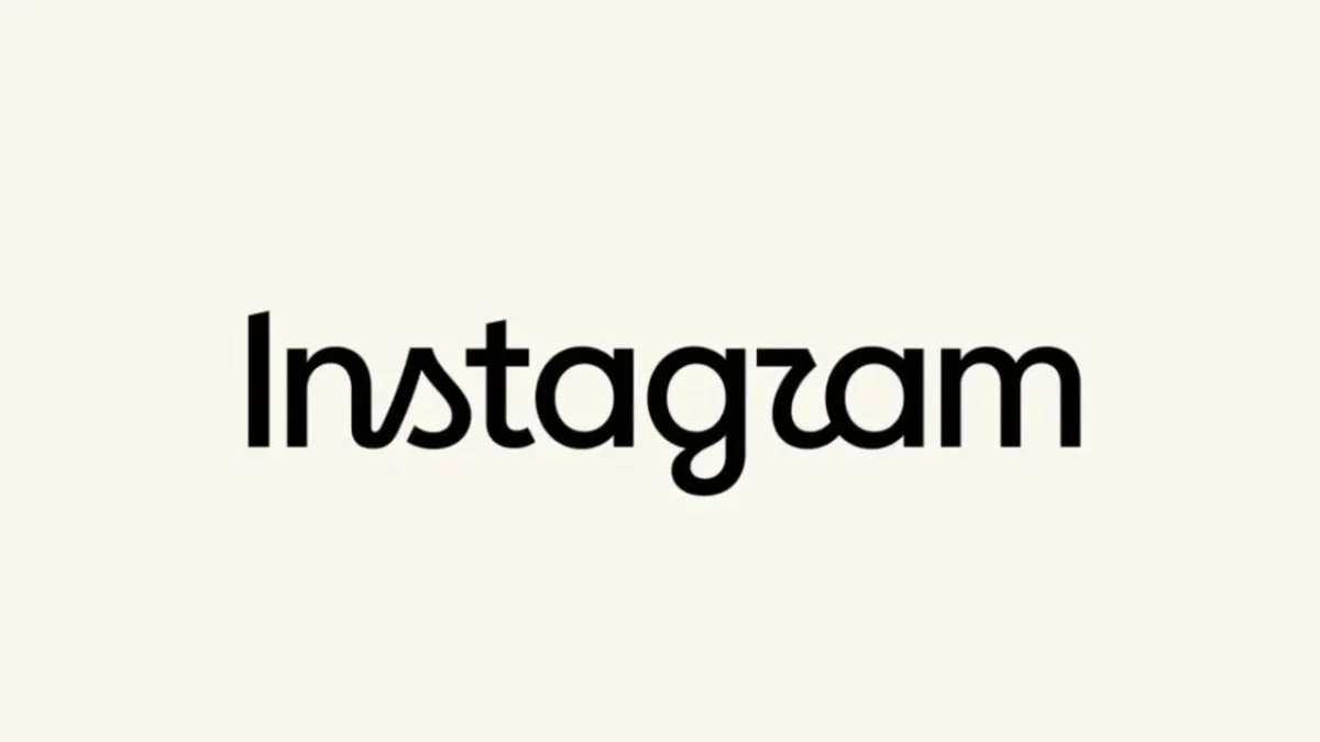
In a digital landscape defined by ephemeral trends and rapid UI/UX iterations, few symbols are as iconic as the stylized script of the Instagram logo. This week, the Meta-owned platform took the bold step of unveiling a redesigned "wordmark"—the text-based logo that appears atop the mobile application—marking the first significant departure from its typographic identity in over a decade. While the leadership team at Instagram frames the change as a necessary evolution toward modernity, the public reception has been far from monolithic, sparking a digital firestorm of debate regarding legibility, design philosophy, and the perils of rebranding a global cultural institution.
The Announcement: A Modern Pivot
Adam Mosseri, the head of Instagram, broke the news to the platform’s massive user base through a post that aimed to contextualize the design shift. By opting for a more streamlined, cursive-inspired typeface, the company intends to "refresh" its identity.
"The ‘wordmark’ above the app has remained untouched for ten years," Mosseri stated in his announcement. "We felt it was time for a refresh. We aimed for something cleaner and more modern, while still weaving in subtle references to the original aesthetic, honoring the simplicity and the artistic spirit that have always defined Instagram."
The announcement was carefully calibrated to position the change as an act of homage rather than a radical departure. By emphasizing the balance between "modernity" and "heritage," Mosseri sought to reassure the creative community that the platform—a sanctuary for photographers and visual artists—still holds its core values in high regard. However, the executive notably clarified that this change applies exclusively to the wordmark. The familiar app icon—the gradient-filled square featuring a stylized camera lens—remains unchanged, preserving the brand’s most recognizable visual asset.
Chronology of an Icon: From Polaroid to Minimalism
To understand why this change feels so significant to the average user, one must look at the evolution of Instagram’s visual identity over the past fifteen years.
- 2010: The Skeuomorphic Era: When Instagram launched, its logo was a hyper-realistic, skeuomorphic representation of a vintage Bell & Howell camera. It captured the early "hipster" ethos of the platform, where filters were meant to mimic the analog imperfections of film photography.
- 2016: The Great Simplification: In a move that shocked the tech world, Instagram pivoted to its current gradient-based icon. This marked a shift away from literal photography towards a more abstract, minimalist aesthetic that aligned with the clean design languages of iOS and Android at the time.
- 2024: The Typographic Evolution: Eight years after the iconic rebrand of the app icon, the platform has turned its attention to the wordmark itself. The goal, according to company design leads, was to create a typeface that feels more "fluid" and "dynamic" in a world dominated by short-form vertical video (Reels) and rapid-fire content consumption.
The Technical Design Debate
The new wordmark represents a departure from the previous, more rigid script. Design analysts have noted that the new typeface utilizes a tighter kerning and a more pronounced slant, intended to mimic a handwritten signature. However, this design choice has become the primary point of contention.
In typography, legibility is often a trade-off with style. By pushing the "r" to look more fluid, the designers inadvertently created a character that, at certain resolutions and font sizes, mimics the appearance of a "z." Similarly, the flow of the "a" and "m" connections has led some users to perceive the word as "Instagzam" or "Instaguam."
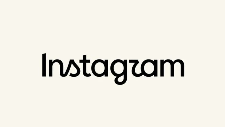
This phenomenon—where a font’s aesthetic intent clashes with the user’s cognitive recognition—is a common pitfall in brand redesigns. When a brand as ubiquitous as Instagram changes its script, it isn’t just changing a font; it is altering the visual habit of billions of people. The "muscle memory" of the eye, which instantly recognizes the logo, is suddenly forced to re-learn how to read the brand name, creating a friction that often manifests as online mockery.
Official Responses and the "Threads" Dialogue
In a modern twist, Mosseri opted to share the new design on Threads, the text-based social network integrated into the Instagram ecosystem. By doing so, he explicitly invited "polemical opinions." This move highlights a shift in corporate communication: rather than hiding behind a sterile press release, leadership is engaging directly with the backlash.
When asked about the perceived legibility issues, Meta’s design team defended the typeface, arguing that it was optimized for the high-density, high-refresh-rate screens of modern smartphones. They argue that the "Z-like R" is a deliberate artistic choice meant to inject a sense of motion into the brand, reflecting the fast-paced nature of Instagram Stories and Reels.
The strategy of "open-sourcing the feedback" is a double-edged sword. While it humanizes the executive team, it also amplifies the negative sentiment, turning a design critique into a viral meme. Threads, being a platform populated by "power users," served as an echo chamber for those most resistant to the change, with many users questioning why the company prioritized a "refresh" over the resolution of long-standing technical bugs or algorithm concerns.
Public Reception: The Nostalgia Factor
The internet’s reaction was immediate and polarized. On platforms like X (formerly Twitter) and Reddit, the discourse quickly devolved into memes. The most common refrain, "Is it just me, or does it say Instagzam?" suggests that for a significant portion of the audience, the branding failed the "glance test."
Beyond the technical complaints, there is a deep sense of "era-ending" sentiment. Many long-time users view the change as symbolic of Instagram’s drift away from its roots as a photo-sharing app. As the platform pivots further toward AI-driven recommendations and video-first consumption, the change in the wordmark is being read by some as the final nail in the coffin of the "old" Instagram.
Conversely, a segment of the design community has defended the move. They argue that the previous logo, while classic, was beginning to look "stiff" and "corporate." The new, looser script is seen by proponents as a better fit for the chaotic, expressive, and often messy nature of contemporary social media culture.

Implications for Meta and the Future of Branding
What does this change mean for Meta’s broader strategy? First, it signals a desire to unify the visual language across the "Metaverse." As Facebook, Instagram, and Threads continue to integrate, having a cohesive design philosophy—even one that draws criticism—is vital for brand recognition.
Second, the incident serves as a case study in the risks of "evolutionary branding." Large-scale tech companies are increasingly trapped in a paradox: they must update their identity to avoid appearing stagnant, but any change risks alienating a user base that demands stability.
The implications for the future are twofold:
- Digital Literacy of Design: We are seeing a more design-literate public. Users no longer passively accept corporate design changes; they analyze, critique, and vocalize their preferences with the same intensity they reserve for political or social issues.
- The "Live" Rebrand: Instagram’s decision to roll this out and immediately gauge reactions on Threads suggests that the future of branding is iterative. If the backlash continues to mount, it is not impossible to imagine a "v2" of the wordmark appearing in the near future, adjusted based on the specific complaints regarding character legibility.
Conclusion: A Lesson in Brand Permanence
The "Instagzam" debate is, at its core, a reflection of how deeply embedded these platforms have become in our daily lives. A logo is no longer just a corporate identifier; it is a gateway to a digital space where users spend hours of their day. When that gateway changes, it feels personal.
As Instagram moves forward with this new identity, the company must balance the aesthetic aspirations of its design team with the functional requirements of its users. Whether this new wordmark will eventually be accepted as a modern classic or remembered as a cautionary tale of "over-designing" remains to be seen. For now, the debate continues to rage, serving as a reminder that in the world of social media, even the smallest stroke of a pen can become a subject of global conversation.
For the average user, the app will continue to function, the feeds will continue to load, and the content will continue to flow. But for the designers and the brand managers at Meta, the next few months will be a masterclass in crisis communication and the delicate art of maintaining a brand’s soul while chasing the horizon of the "clean and modern." As we look toward the future of digital identity, one thing is clear: the era of the static brand is over, replaced by a fluid, debated, and constantly evolving digital presence.