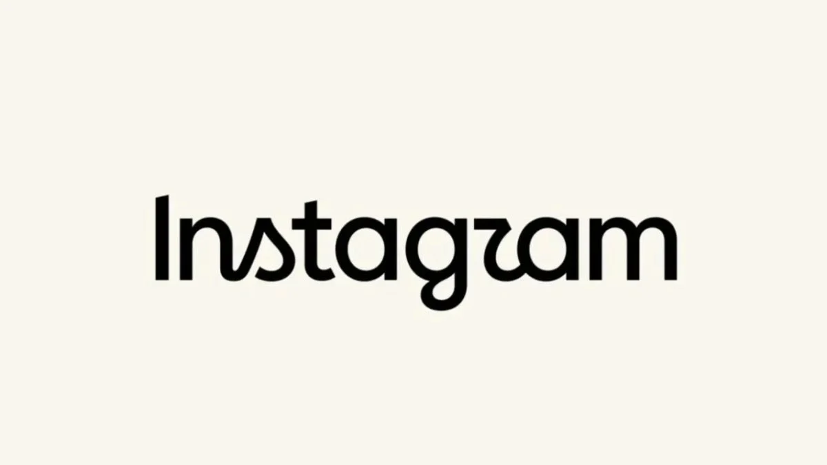
In a move that has sent ripples through the digital design community and the global user base of Meta’s premier visual platform, Instagram has officially retired the logotype (or "wordmark") that has served as the brand’s identity for the past ten years. Adam Mosseri, the head of Instagram, announced the update this Thursday, characterizing the new design as "cleaner and more modern." However, as the digital dust settles, the reception from the platform’s billions of users has been anything but uniform, sparking a fierce debate over typography, legibility, and the challenges of evolving a globally recognized aesthetic.
The Core Transformation: A Shift in Identity
For over a decade, the Instagram wordmark—the stylized, cursive script that appeared at the top of the mobile application—remained a constant, anchoring the visual experience of the app. It was a hallmark of the early "app-centric" era of mobile technology. The new design, while retaining the essence of the original, opts for a more simplified, fluid, and stylized cursive script.
According to Mosseri, the objective of this redesign was to "refresh" the brand’s identity to align it with contemporary design trends. In a post shared on his own Instagram account, Mosseri stated: "The wordmark above the app hasn’t changed in ten years, so it was time to refresh it. It is cleaner and more modern, with references to the original and the simplicity and art that have always made Instagram what it is."
Crucially, the redesign strictly concerns the text-based logo. The iconic app icon—the gradient-filled square featuring a stylized camera lens—remains unchanged, continuing to serve as the platform’s primary visual anchor. By keeping the icon stable while updating the typography, Instagram is attempting to bridge the gap between historical familiarity and modern minimalist standards.
A Chronology of Instagram’s Visual Evolution
To understand the significance of this change, one must look at the platform’s visual journey.
- 2010: The Launch. Instagram debuted with a skeuomorphic icon, mimicking a vintage Polaroid camera, paired with a distinct, handwritten-style wordmark that emphasized the platform’s focus on "instant" photography.
- 2013-2015: Refinement. As the platform grew from a niche photography app to a social media powerhouse, the logo saw minor tweaks to improve scalability on higher-resolution smartphone screens.
- 2016: The Great Rebrand. This marked the most significant shift in the company’s history. Instagram replaced its iconic camera icon with a vibrant, flat-design gradient logo. At the time, the change was met with widespread skepticism, yet it eventually became one of the most recognizable icons in the history of Silicon Valley.
- 2024: The Wordmark Refresh. After ten years of consistency, the company has decided that the wordmark no longer reflected the "modern" aesthetic of the platform, leading to the current iteration.
The Digital Backlash: Decoding the "Instagzam" Phenomenon
Following the announcement on Instagram and its sibling platform, Threads, the company invited user feedback, prompting a deluge of reactions. While corporate design teams often aim for "sophistication," the public response has been a mix of confusion and mockery.
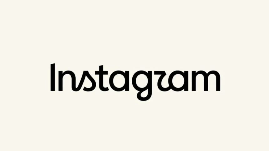
A significant portion of the user base has taken to social media to critique the legibility of the new font. The primary point of contention is the rendering of the letter "r." Many users argue that the new, flowing script makes the final letter indistinguishable from a "z."
"Is it just me, or does it read ‘Instagzam’?" one user noted, a sentiment that quickly gained traction across the platform. Others have interpreted the word as "Instaguam." This linguistic ambiguity serves as a case study in the perils of modern branding, where designers often prioritize artistic fluidity over functional clarity. The discourse highlights a growing tension between "high-design" aesthetics favored by corporate entities and the practical requirements of everyday user interfaces.
Professional Analysis: The Philosophy of Minimalist Design
From a design perspective, the move is consistent with the broader industry trend of "blanding"—the process by which tech companies move toward simplified, often sans-serif or highly stylized, uniform typography. Experts suggest that by moving toward a more simplified script, Instagram is attempting to shed the "nostalgic" weight of the early 2010s in favor of a look that feels more native to the high-definition, high-speed nature of current digital consumption.
However, the "r to z" confusion is not merely a user-side complaint; it is a fundamental challenge in typography. Legibility, particularly at small sizes on mobile displays, is the ultimate metric of a logo’s success. If a user cannot immediately recognize the brand name, the brand equity is technically compromised.
The Broader Context: Meta’s Strategic Shifts
This rebranding effort arrives during a tumultuous period for Meta’s suite of applications. The company has recently faced a series of high-profile global outages, including a significant collapse in service for both Facebook and Instagram, which left millions of users worldwide disconnected.
Furthermore, Instagram has been aggressively altering its operational policies. The platform recently introduced a requirement for users to have a minimum of 1,000 followers to access certain live-streaming features. When viewed alongside these functional restrictions, the visual rebrand can be interpreted as an attempt by the company to exert tighter control over its "creative" identity, even as it faces criticism regarding its accessibility and utility.

Implications for the Future of Brand Identity
The reaction to the new Instagram logo serves as a cautionary tale for tech giants. In an era where users are deeply attached to the digital products they interact with for hours each day, a logo is not just an image—it is a touchstone.
The move to a "cleaner and more modern" look is a clear signal that Instagram is distancing itself from its origins as a simple photo-sharing filter app and cementing its role as a multifaceted media conglomerate. By sharing the update on Threads—the company’s text-based alternative to X (formerly Twitter)—Mosseri is actively trying to consolidate the brand experience across the entire Meta ecosystem.
Conclusion: Will the "Instagzam" Stick?
History suggests that user outrage over brand updates is typically ephemeral. When Instagram changed its app icon in 2016, the internet was ablaze with criticism; today, that icon is considered a masterclass in modern digital design. It is possible that the "Instagzam" or "Instaguam" confusion will dissipate as the new font becomes a part of the daily digital wallpaper.
However, for now, the incident serves as a reminder of the delicate balance between innovation and tradition. As Instagram continues to evolve, the challenge for Mosseri and his design team will be to ensure that the platform remains as intuitive and accessible as it is aesthetically pleasing. For the millions of creators, influencers, and casual users who define the platform’s culture, the name "Instagram" is more than a logo—it is a global language of connection. Whether this new, cursive script will eventually be viewed as a design evolution or a missed opportunity remains to be seen.
For the time being, the company stands by its choice, framing the critique as part of the "polemical opinions" that accompany any significant change in the digital landscape. As the platform moves forward, the focus will likely return to the core features—the content, the community, and the algorithms—leaving the font to settle into its new place in the history of social media design.