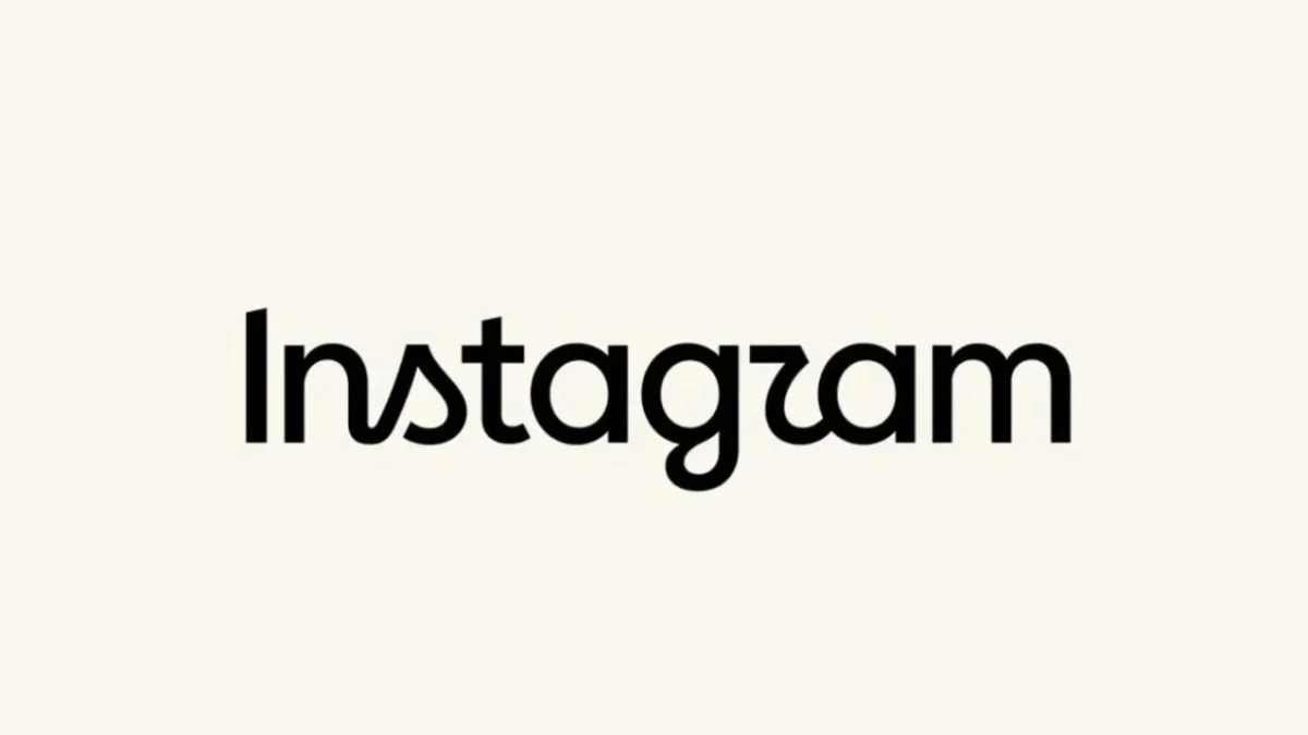
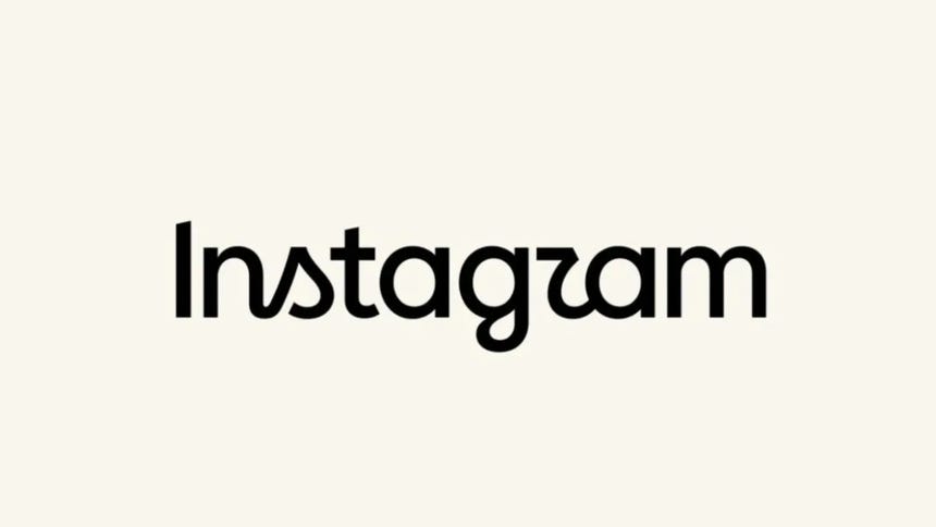
In a significant branding pivot that marks the end of a decade-long era, Instagram has officially updated its "wordmark"—the iconic stylized script used to represent the platform’s name. The change, which rolled out this Thursday, introduces a more streamlined, cursive-inspired typeface aimed at refreshing the brand’s visual identity. While the company frames this as a necessary evolution to reflect "simplicity and art," the reception from its massive global user base has been sharply divided, ranging from nostalgic resignation to outright confusion regarding the legibility of the new typography.
The Core Transformation: A Shift in Aesthetics
Adam Mosseri, the head of Instagram, spearheaded the announcement, utilizing both the primary platform and Meta’s companion app, Threads, to explain the rationale behind the design shift. According to Mosseri, the previous wordmark, which had remained static for ten years, no longer aligned with the platform’s current design language.
"The ‘wordmark’ above the app hasn’t changed in a decade, so it was time to refresh it," Mosseri noted. "The goal was to create something cleaner and more modern, while still maintaining essential references to the original design and the core values of simplicity and creativity that have defined Instagram since its inception."
Crucially, the update is strictly confined to the text-based brand name. The iconic app icon—the familiar rounded square featuring a stylized camera lens against a vibrant purple-to-orange gradient—remains unchanged. By leaving the app icon untouched, Meta appears to be attempting a delicate balance: modernizing the brand’s textual presence without alienating users who have grown accustomed to the visual shorthand of the existing application icon.
A Chronological Perspective: Ten Years of Visual Evolution
To understand the weight of this change, one must look at the history of Instagram’s branding. Launched in 2010, Instagram began with a skeuomorphic icon—a detailed, retro-style camera that paid homage to the platform’s initial focus on filtered photography.
- 2010–2016: The platform established its initial identity with a warm, nostalgic aesthetic. The wordmark during this period was characterized by a classic, friendly script that mirrored the "analog" feel of early mobile photography.
- 2016: A massive overhaul occurred. Instagram transitioned to the flat, minimalist, gradient-heavy icon that persists to this day. At the time, this shift was met with significant public outcry, yet it eventually became the gold standard for modern mobile design.
- 2024–2025: Throughout the last year, Instagram has been subtly shifting its interface to accommodate a more video-centric experience (Reels). The new wordmark is a logical conclusion to this design journey, shedding the "heavy" loops of the previous script in favor of a lighter, more agile aesthetic.
- 2026 (The Current Change): The introduction of the new, simplified cursive wordmark marks the first structural change to the brand’s textual identity in ten years, signaling a departure from the "playful" origins of the early 2010s toward a more professional, corporate-yet-artistic visual language.
Supporting Data and Brand Psychology
Design experts suggest that this change is more than just an aesthetic choice; it is a calculated move in the attention economy. In an era where Instagram competes directly with platforms like TikTok, the brand needs to appear "modern" and "streamlined" to maintain its appeal to younger demographics (Gen Z and Alpha).
From a psychological standpoint, the move to a more cursive, fluid typeface suggests a desire to emphasize "artistry"—a nod to the platform’s roots as a space for creators. However, typography is a delicate science. When a brand alters its wordmark, it risks "brand dilution." Research into visual recognition shows that users process familiar logos instantaneously; by altering the typeface, Instagram forces the brain to "re-learn" the brand, which can lead to temporary friction and negative sentiment.
Official Responses and the "Threads" Dialogue
Adam Mosseri took an unusually transparent approach to the rollout. By posting the new logo on Threads—a platform designed for conversational discourse—and explicitly inviting "controversial opinions," Mosseri demonstrated an awareness that the change would not be universally celebrated.
The strategy of leaning into the controversy is a hallmark of modern tech leadership. By opening the floor to criticism, the leadership team attempts to humanize the corporation, turning a design decision into a dialogue. Yet, the official stance remains firm: the company believes the new typeface is more readable in the context of high-resolution, modern smartphone displays, where the older, thicker lines of the previous script could occasionally appear cluttered.
The User Response: A Clash of Perspectives
Despite the intent behind the redesign, the immediate reaction from the public has been one of skepticism. Social media platforms, particularly X (formerly Twitter) and Instagram’s own comment sections, were flooded with memes and critiques shortly after the announcement.
The "Legibility" Critique
The most prominent complaint concerns the readability of the new font. Many users have pointed out that the new lowercase ‘r’ in "Instagram" bears a striking resemblance to a ‘z’. This has led to widespread jokes about the platform being misread as "Instagzam," "Instaguam," or even "Instag-ram" with a confusing character. This highlights a common pitfall in modern branding: the trend toward minimalism often sacrifices character recognition for visual elegance.
The Nostalgic Sentiment
Conversely, a segment of the user base has embraced the change, viewing it as a necessary evolution. For these users, the redesign serves as a marker of growth. "It’s the end of an era," one user commented, acknowledging that while they will miss the old look, change is an inevitable component of a platform that has successfully transitioned from a photo-sharing app to a global video and social networking powerhouse.
Broader Implications: What This Means for Meta
The update to the wordmark is part of a larger, systemic shift within Meta’s ecosystem. As the company navigates increasing regulatory scrutiny—ranging from the Supreme Court of Brazil’s recent mandates on content moderation to global concerns regarding data privacy and platform stability—the need for a cohesive, professional brand identity has never been higher.
1. Market Positioning
By "refreshing" its identity, Instagram is signaling to advertisers and creators that it is a platform that continues to innovate. A brand that does not update its visual identity is often perceived as stagnant. For Meta, keeping Instagram looking "fresh" is vital to maintaining its multi-billion dollar advertising revenue.

2. Design Consistency
The new wordmark is likely designed to scale better across different mediums, from the small screens of smartwatches to large-format digital billboards. The previous, more intricate script struggled with legibility at smaller scales. The new design, with its wider apertures and thinner stroke weight, is technically superior for modern responsive web design.
3. The Future of the "Instagram" Brand
This change also suggests that Meta is preparing for a future where Instagram is more than just an app; it is a brand identity that must stand alongside Facebook, WhatsApp, and Threads. By simplifying the wordmark, the company creates a more "neutral" visual foundation that can house new features, AI integrations, and future content formats without looking dated.
Conclusion: Will the "Instagzam" Controversy Pass?
History suggests that the backlash to this redesign will likely be short-lived. In 2016, the outcry over the gradient icon was deafening; today, that icon is one of the most recognized symbols in the world. While the current criticism regarding the "r" looking like a "z" is valid from a typographic standpoint, the human brain is highly adaptable.
As users continue to scroll through their feeds, the new wordmark will inevitably become the new "normal." Instagram’s move is a reminder that in the fast-paced world of digital media, stability is a luxury. Whether the change is seen as a stroke of modern genius or an unnecessary tweak to a classic design, the platform continues to push forward, proving that even a decade-old brand must occasionally reinvent itself to remain relevant in the eyes of its users.
For now, the debate continues, and while the "Instagzam" memes may persist, the platform’s commitment to its new visual identity remains absolute. The transition is not just about a font change; it is a statement of intent for the next decade of digital interaction.