Introduction: A Strategic Refresh
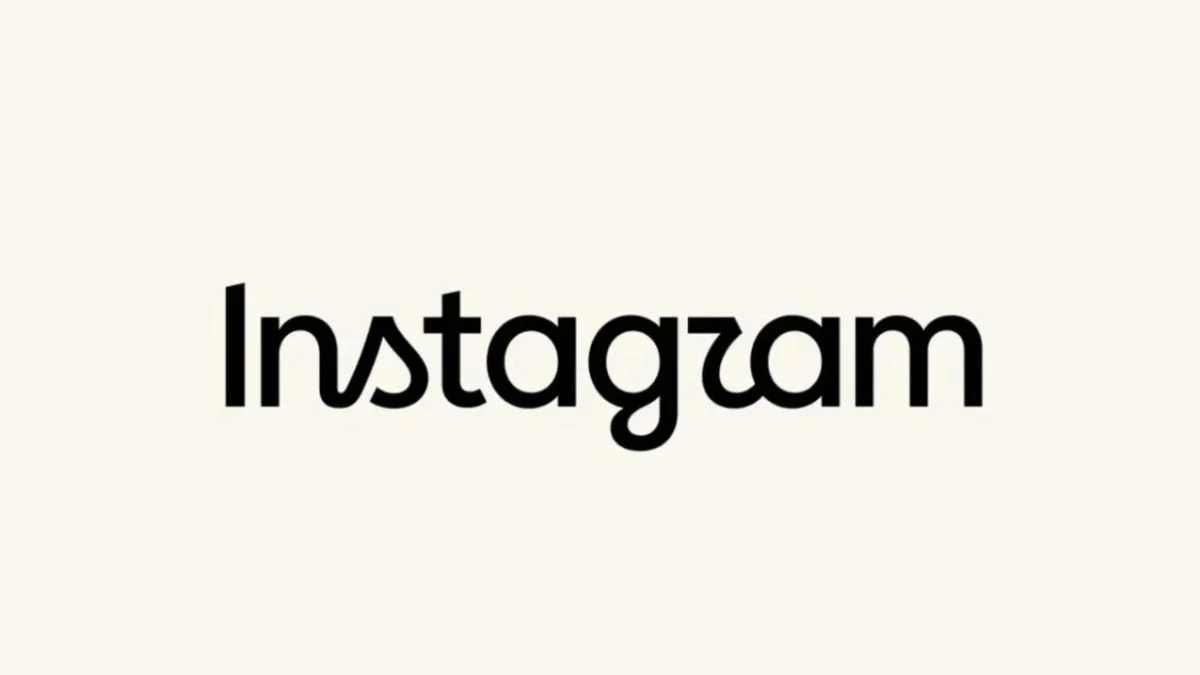
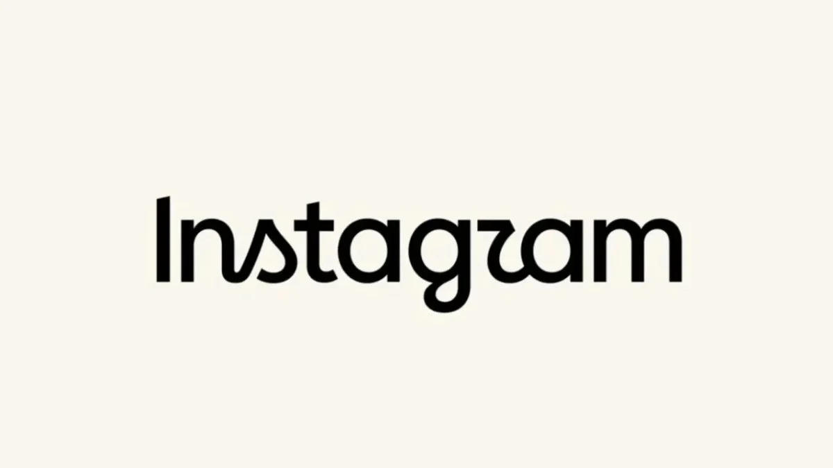
In the fast-paced world of digital branding, consistency is often prized, but evolution is essential for survival. This week, Meta-owned Instagram took a significant step in refreshing its corporate identity by unveiling a redesigned "wordmark"—the official logo of its name. After ten years of visual stability, the platform has introduced a sleeker, more fluid typeface that aims to balance modern minimalism with the artistic roots that propelled the app to global prominence.
The announcement, spearheaded by Instagram’s director, Adam Mosseri, marks a pivot toward a more cohesive aesthetic language. However, as is often the case with major tech giants, the change has sparked a firestorm of debate across the very platform it seeks to represent. From design enthusiasts praising the subtle nuances to vocal critics baffled by the legibility of the new script, the rollout has become a case study in the complexities of rebranding for a massive, multi-generational user base.
The Chronology: Ten Years of Visual Evolution
To understand the significance of this change, one must look at the timeline of Instagram’s visual identity.
- 2010–2013: The original Instagram logo featured a skeuomorphic, retro-style camera icon. The wordmark was stylized in a classic, bold script that felt like a nostalgic nod to analog photography.
- 2013–2016: As the platform grew, the wordmark was refined to look cleaner, though it remained faithful to the original script style.
- 2016: This was the most controversial year in Instagram’s design history. The company abandoned the skeuomorphic camera for a flat, gradient-heavy icon (purple to orange) and a simplified wordmark. This design remained the standard for the following decade.
- 2024: The current shift marks the first major update to the wordmark since 2016. While the iconic "camera icon" remains untouched, the text that accompanies it within the app interface has undergone a complete overhaul.
The Design Philosophy: "Clean and Modern"
Adam Mosseri, who has become the public face of the platform’s strategic shifts, took to his own account to explain the rationale behind the change. According to Mosseri, the previous wordmark had become a relic of a bygone era in design.
"The wordmark above the app hasn’t changed in ten years, so it was time to refresh it," Mosseri stated. He emphasized that the design team sought a balance between "clean and modern" aesthetics and the platform’s core values: simplicity and artistry. By utilizing a more fluid, italicized font, the brand aims to signal movement and creativity, moving away from the rigid, blocky nature of the previous iteration.
Interestingly, the update focuses exclusively on the text. The famous squircle-shaped camera icon—which underwent its own dramatic transformation in 2016—remains unchanged. By isolating the refresh to the wordmark, Instagram is attempting to modernize its identity without alienating users who have developed a deep psychological attachment to the iconic purple-and-orange camera icon.
Official Responses and the Role of Threads
Mosseri’s approach to the launch was characteristically interactive. He did not merely issue a press release; he cross-posted the news to Threads, the text-based companion app integrated within the Instagram ecosystem. By sharing the design on Threads, Mosseri effectively gamified the announcement, inviting "polemical opinions" from the community.
This transparency serves a dual purpose: it builds engagement across Meta’s product lines and allows the company to perform real-time sentiment analysis on the design change. By inviting critique, Instagram creates an illusion of agency for its users, even if the decision-making process was finalized behind closed doors at the company’s Menlo Park headquarters.
The User Backlash: A Lesson in Typography
While the design team at Instagram likely viewed the change as an elegant evolution, the user base had a different reaction. Within hours of the update, the platform was flooded with comments, memes, and feedback. The primary point of contention? Legibility.
The "Instagzam" Phenomenon
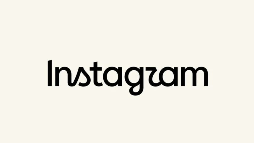
Social media users are notoriously sensitive to change, but the criticism regarding this update was remarkably specific. Many users complained that the new, flowing italicized script makes the letter "r" look suspiciously like a "z."
"Is it just me, or does it read ‘Instagzam’?" one user quipped on the platform. Others echoed this sentiment, suggesting the new logo looks like "Instaguam" or "Instagzam." In typography, legibility is the primary goal of any wordmark. If a brand’s name is misread—especially by a user base that interacts with the logo thousands of times per year—it is generally considered a failure of functional design.
Nostalgia and the "End of an Era"
Beyond the specific grievances regarding the font, there is a palpable sense of nostalgia. For many of Instagram’s early adopters, the previous logo represented the "golden age" of the app. Users took to the comment sections to lament the "end of an era," signaling that for some, the change is not just aesthetic—it is an unwelcome reminder that the platform is moving further away from its humble, photo-sharing origins toward an algorithmically driven, video-first content hub.
Implications for Meta’s Branding Strategy
The rebranding of Instagram occurs against a backdrop of wider challenges for Meta. The company has been dealing with global technical instability, regulatory pressure in regions like Brazil regarding illegal content, and the constant need to balance profitability with user retention.
1. Unified Brand Identity
Meta is currently in a phase of harmonizing its apps. By refreshing Instagram’s wordmark, the company may be looking to align it more closely with the visual language used across other Meta properties, such as WhatsApp and the main Facebook app. Consistency in branding helps build a "Meta ecosystem" that feels integrated.

2. The Cost of Modernization
Design updates for platforms with billions of users are never just "aesthetic choices." They represent significant engineering efforts. Every pixel changed in the UI requires testing across thousands of device models, operating systems, and screen resolutions. This refresh signifies that Meta is willing to invest heavily in keeping its flagship app feeling "fresh" to stave off competition from platforms like TikTok, which has dominated the youth demographic.
3. User Sentiment vs. Corporate Vision
The current situation highlights a classic corporate dilemma: the tension between user preference and modern design trends. While design professionals might argue that the new, thinner, italicized font aligns with modern luxury and tech-minimalism, the average user values familiarity. If the user base continues to mock the logo as "Instagzam," Instagram may face a difficult choice: double down on its new brand identity, or issue a "correction" in the coming months.
Conclusion: The Future of Instagram
The controversy over the new wordmark is, in many ways, a microcosm of the challenges Instagram faces today. As it moves further from the simple photo-sharing app of 2010, every design change becomes a lightning rod for criticism. The platform is attempting to project an image of an artistic, modern, and evolving tool, while its users are clinging to the familiarity of the past.
Ultimately, whether the new logo succeeds will not be determined by design awards or the opinions of typographers, but by whether the users continue to return to the app. For now, the "Instagzam" memes are providing the company with free marketing and high engagement—a result that, for a social media giant, might be just as valuable as a perfectly legible font.
As Instagram continues to iterate, the lesson remains clear: in the digital age, a brand is not just what the company says it is, but what the community perceives it to be. For now, Instagram’s identity is in a state of flux, mirroring the very platform it represents—dynamic, sometimes confusing, and constantly under the scrutiny of its massive global audience.